I use the entire suite of products produced by Developer Express, Inc. or DevExpress. While experimenting with various form layouts, I realized that their DataNavigator control; one of the many controls included in their XtraEditors™ Library applied special skinning. If you are not familiar with DevExpress, or their controls; they support an application-wide Look & Feel and custom skinning.
*NOTE: This solution relies on the DevExpress XtraEditors™ Library and extends it, it does not try to create an independent solution.
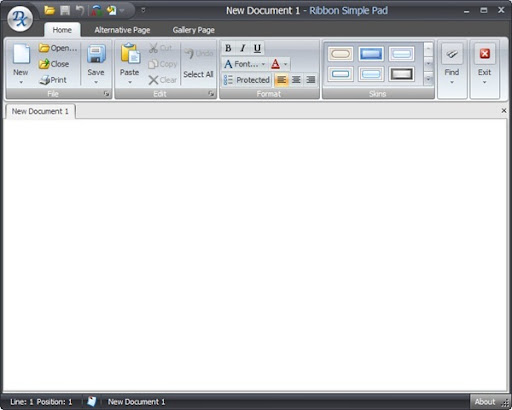
Here is a screen shot of the Developer Express Ribbon Control combined with many of their other editors:
The DataNavigator has a special look; especially when displayed using Office2007 skins.
Here are various screen shots of the control:
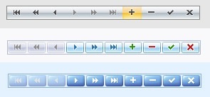
As you can see, the display of the control changes dramatically depending on the Look & Feel selected by the end-user of the application.
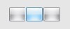
I ran into a scenario where I wanted to add custom controls to my form that maintained the same Look & Feel as the DataNavigator. I tried adding SimpleButtons to the form and discovered that I could not get the buttons to match the same appearance. Here is a screen shot of three SimpleButtons set side-by-side using the same Look & Feel as the first (silver-colored) image:
The highlighting is vertical as opposed to horizontal, the hover color is blue versus orange, and there are noticeable borders where the DataNavigator displays as a continuous strip for this particular style. There are many, many different schemes or styles available and I wanted to add a control that matched the DataNavigator for all of them.
I started by creating a custom button that inherited from the SimpleButton so that I started with all the built-in features of the DevExpress SimpleButton.
*NOTE - I am using a Code Snippet Plugin for WLW (Windows Live Writer (Beta)) created by Leo Vildosola and this is my first attempt to use it. I still have an issue where my code gets left justified when I post. I am hoping to correct it soon. There is a link at the bottom to download the entire VS2005 solution.
Here is the code for the CustomSimpleButton:
using System;
using DevExpress.XtraEditors;
using DevExpress.XtraEditors.ViewInfo;
namespace CustomSimpleButton {
public class CustomButton : SimpleButton {
public CustomButton() {
this.TabStop = this.AllowFocus = false;
}
CustomButtonViewInfo m_customButtonViewInfo;
protected override BaseStyleControlViewInfo CreateViewInfo() {
if (m_customButtonViewInfo == null)
m_customButtonViewInfo = new CustomButtonViewInfo(this);
return m_customButtonViewInfo;
}
}
}
Simply inheriting from the SimpleButton wouldn't do much, I needed to create a custom view (appearance) for the button.
I wanted my button's custom view to load a custom painter whenever skins are applied, but decided I could use the standard painters whenever skins are not used; DevExpress controls support skinned and non-skinned themes. The difference is that skins require loading specific images from built-in resource files.
Here is the code for the CustomButtonViewInfo that selects the appropriate painter:
using System;
using DevExpress.XtraEditors;
using DevExpress.XtraEditors.Controls;
using DevExpress.XtraEditors.ViewInfo;
namespace CustomSimpleButton {
public class CustomButtonViewInfo : SimpleButtonViewInfo {
public CustomButtonViewInfo(SimpleButton owner)
: base(owner) {
}
public override DevExpress.XtraEditors.Drawing.EditorButtonPainter ButtonPainter {
get {
BorderStyles style = BorderStyles.Default;
switch (LookAndFeel.ActiveLookAndFeel.ActiveStyle) {
case DevExpress.LookAndFeel.ActiveLookAndFeelStyle.Flat:
style = BorderStyles.Flat;
break;
case DevExpress.LookAndFeel.ActiveLookAndFeelStyle.UltraFlat:
style = BorderStyles.UltraFlat;
break;
case DevExpress.LookAndFeel.ActiveLookAndFeelStyle.Style3D:
style = BorderStyles.Style3D;
break;
case DevExpress.LookAndFeel.ActiveLookAndFeelStyle.Office2003:
style = BorderStyles.Office2003;
break;
case DevExpress.LookAndFeel.ActiveLookAndFeelStyle.Skin:
if (m_customSkinButtonPainter == null)
m_customSkinButtonPainter = new CustomSkinButtonPainter(LookAndFeel.ActiveLookAndFeel);
return m_customSkinButtonPainter;
case DevExpress.LookAndFeel.ActiveLookAndFeelStyle.WindowsXP:
style = BorderStyles.Simple;
break;
}
return EditorButtonHelper.GetPainter(style, LookAndFeel, true);
}
}
CustomSkinButtonPainter m_customSkinButtonPainter;
protected override void UpdatePainters() {
base.UpdatePainters();
}
}
}
Well, here is where I created a painter to fetch the very same skins used by the DataNavigator (in essence, I substitute or replace the standard skins for the DataNavigator skins)
using System;
using DevExpress.Skins;
using DevExpress.XtraEditors.Drawing;
namespace CustomSimpleButton {
public class CustomSkinButtonPainter : SkinEditorButtonPainter {
public CustomSkinButtonPainter(ISkinProvider provider)
: base(provider) {
}
protected override DevExpress.Skins.SkinElement GetSkinElement(EditorButtonObjectInfoArgs e, DevExpress.XtraEditors.Controls.ButtonPredefines kind) {
SkinElement res = EditorsSkins.GetSkin(Provider)[EditorsSkins.SkinNavigatorButton];
if (res != null) return res;
if (e.BuiltIn) return EditorsSkins.GetSkin(Provider)[EditorsSkins.SkinEditorButton];
return CommonSkins.GetSkin(Provider)[CommonSkins.SkinButton];
}
}
}
Now I have a button that does skin like the DataNavigator, but its a SimpleButton and does not act as a strip of buttons. To be honest, my task really only needed a simple button that appeared like the DataNavigator. I decided to go a little deeper and create a control that appears like the DataNavigator (button images and all).
This code has a quick 'hack' (actually it works okay - never in right to left languages) to scale the buttons when the control is resized. I added a panel control and apply the appropriate style to get a very close approximation to the border changes with the DataNavigator, and I load the actual images used by the DataNavigator from the DevExpress resources. That was complicated by the fact that several styles use different images.
Here is the code for the control:
using System;
using System.Collections.Generic;
using System.Drawing;
using DevExpress.LookAndFeel;
using DevExpress.Skins;
using DevExpress.Utils;
using DevExpress.XtraEditors;
namespace CustomSimpleButton {
public partial class CustomButtonsControl : DevExpress.XtraEditors.XtraUserControl {
public CustomButtonsControl() {
InitializeComponent();
SetStyle();
InitEventHandlers();
}
List<CustomButton> m_buttons = new List<CustomButton>();
ImageCollection m_navigatorSkinImages;
static ImageCollection m_defaultImages = null;
const string internalImageResourceName = "DevExpress.XtraEditors.Images.Navigator.bmp";
private void InitEventHandlers() {
ApplyPanelStyle(this.LookAndFeel.ActiveLookAndFeel.Style);
this.LookAndFeel.StyleChanged += new EventHandler(LookAndFeel_StyleChanged);
this.SizeChanged += new EventHandler(CustomButtonsControl_SizeChanged);
}
protected internal object GetDefaultImages() {
if (LookAndFeel.ActiveStyle == ActiveLookAndFeelStyle.Skin) {
SkinElement element = EditorsSkins.GetSkin(LookAndFeel)[EditorsSkins.SkinNavigator];
if (element.Image != null) return element.Image.GetImages();
}
return ImagesDefault;
}
static object ImagesDefault {
get {
if (m_defaultImages == null) {
m_defaultImages = DevExpress.Utils.Controls.ImageHelper.CreateImageCollectionFromResources(
internalImageResourceName, typeof(NavigatorButtonsBase).Assembly,
new Size(11, 11));
}
return m_defaultImages;
}
}
public void ApplyImages() {
this.sbFirst.Image = m_navigatorSkinImages.Images[0];
this.sbPrevPage.Image = m_navigatorSkinImages.Images[1];
this.sbPrev.Image = m_navigatorSkinImages.Images[2];
this.sbNext.Image = m_navigatorSkinImages.Images[3];
this.sbNextPage.Image = m_navigatorSkinImages.Images[4];
this.sbLast.Image = m_navigatorSkinImages.Images[5];
this.sbAdd.Image = m_navigatorSkinImages.Images[6];
this.sbDelete.Image = m_navigatorSkinImages.Images[7];
this.sbAccept.Image = m_navigatorSkinImages.Images[9];
this.sbCancel.Image = m_navigatorSkinImages.Images[10];
// ... etc, etc to use navigator button images (loaded from DevExpress skins)
}
public void ApplyPanelStyle(LookAndFeelStyle style) {
switch (style) {
case DevExpress.LookAndFeel.LookAndFeelStyle.Flat:
this.panelControl1.BorderStyle = DevExpress.XtraEditors.Controls.BorderStyles.Flat;
break;
case DevExpress.LookAndFeel.LookAndFeelStyle.UltraFlat:
this.panelControl1.BorderStyle = DevExpress.XtraEditors.Controls.BorderStyles.UltraFlat;
break;
case DevExpress.LookAndFeel.LookAndFeelStyle.Style3D:
this.panelControl1.BorderStyle = DevExpress.XtraEditors.Controls.BorderStyles.Style3D;
break;
case DevExpress.LookAndFeel.LookAndFeelStyle.Office2003:
this.panelControl1.BorderStyle = DevExpress.XtraEditors.Controls.BorderStyles.Office2003;
break;
case DevExpress.LookAndFeel.LookAndFeelStyle.Skin:
this.panelControl1.BorderStyle = DevExpress.XtraEditors.Controls.BorderStyles.Default;
break;
}
}
public void AddButton(CustomButton button) {
this.m_buttons.Add(button);
}
private void StoreButtonReferences() {
if (m_buttons.Count < 1) {
AddButton(this.sbFirst);
AddButton(this.sbPrevPage);
AddButton(this.sbPrev);
AddButton(this.sbNext);
AddButton(this.sbNextPage);
AddButton(this.sbLast);
AddButton(this.sbAdd);
AddButton(this.sbDelete);
AddButton(this.sbAccept);
AddButton(this.sbCancel);
}
}
public void CalcButtonLayout() {
StoreButtonReferences();
/// this is a semi-okay hack to make buttons scale when the grab handles are dragged.
int workingSpaceWidth = this.Width - 2;
int widthPerButton = (int)Math.Round(((decimal)workingSpaceWidth / m_buttons.Count), 0);
int startPos = 2;
int counter = 1;
int prevButtonPos = 1;
foreach (CustomButton button in m_buttons) {
button.Width = widthPerButton;
button.Left = startPos;
button.Top = 2;
button.Height = this.panelControl1.Height - 4;
if (counter == m_buttons.Count) {
button.Width = (this.Width - 2) - startPos;
}
counter++;
prevButtonPos = startPos;
startPos = button.Right;
}
this.Invalidate();
}
void CustomButtonsControl_SizeChanged(object sender, EventArgs e) {
CalcButtonLayout();
}
private void SetStyle() {
//navigator images change with different styles
m_navigatorSkinImages = (ImageCollection)GetDefaultImages();
ApplyImages();
ApplyPanelStyle(this.LookAndFeel.ActiveLookAndFeel.Style);
}
void LookAndFeel_StyleChanged(object sender, EventArgs e) {
SetStyle();
}
}
}
What is the result? Well, for the most part the controls are identical: There are some differences on exact borders and the Money Twins theme has a much darker appearance for the the buttons on the DevExpress control (I think they have them set to some always hot state).. and of course my sizing logic is not nearly as robust and will differ slightly. Overall, I am very happy and did get what I was seeking.
If you are a DevExpress user and want to see/try the result for yourself, download the code and experiment with the control. Keep in mind that all I wanted was something reasonably close and I certainly went deeper than I intended with the multi-button control. Maybe someone can help me improve it? Maybe, at least, it will spark some ideas?
Download the VS2005 solution Here
Trevor

3 comments:
I tried your code the the last past give me plenty of error.
With a 3 first parts, I have a "CustomSimpleButton", I have a button but with the same look of a SimpleButton Tongue Tied
I use the version 8.3.2 of DXperience.
I posted a link to a working solution in Visual Studio. Did you try it?
I find it fascinating how easily you can customize the appearance of buttons within this framework.
Post a Comment